Modernizing B2B E-commerce for CC Wholesale Clothing
Overview
As the parent company of MyOnlineFashionStore (MOFS) and a major player in the Los Angeles fashion district, CC Wholesale Clothing serves a massive audience of boutique owners and retailers. Their homepage acts as the digital storefront for a vast catalog of apparel, jewelry, and accessories. The objective of this project was to elevate the brand’s digital presence, transforming a traditional, dense wholesale site into a premium, modern e-commerce experience that facilitates high-volume purchasing without overwhelming the buyer.
Challenge
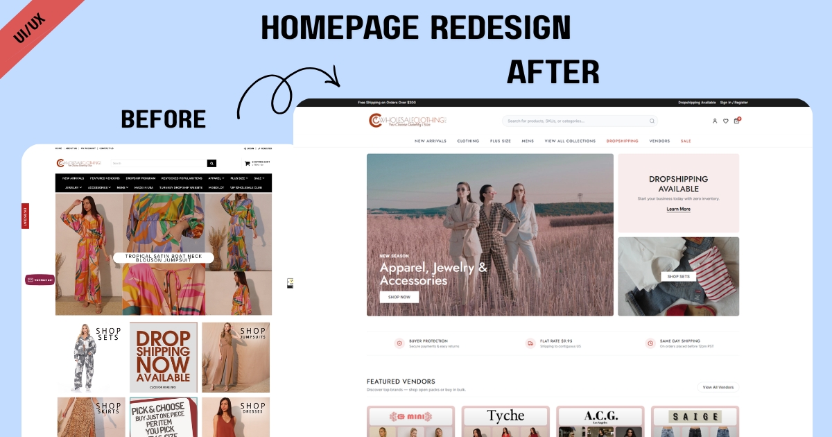
Wholesale e-commerce sites frequently fall into the trap of information overload, and the legacy CCWC homepage was no exception. Visitors were immediately greeted by a hyper-dense navigation menu, aggressively competing promotional banners (“Shop Sets,” “Dropshipping Now,” “Pick & Choose”), and a cluttered featured vendor carousel. This lack of visual hierarchy created significant cognitive friction. For a B2B buyer looking to efficiently restock their store, this high “brain load” and chaotic layout made finding specific categories or trusted vendors unnecessarily difficult, creating roadblocks in the conversion funnel.
Solution
We executed a complete architectural and visual overhaul focused on Conversion Rate Optimization (CRO) and intuitive navigation. We streamlined the main menu and replaced the chaotic banner grid with a clean, cohesive hero section and distinct, modular pathways for Dropshipping and Category browsing. The confusing vendor carousel was upgraded to a clean, grid-based layout. By developing the new homepage utilizing native Custom Liquid, we ensured the site remains lightning-fast and highly responsive, entirely avoiding the bloat of third-party page builders. We introduced strategic whitespace, a softer color palette, and a clear “How It Works” section, ultimately creating a frictionless, high-converting pathway for wholesale buyers.
Results

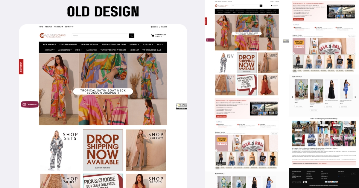
View Some Screenshots from Old Design
To understand the necessity of this redesign, the legacy layout provides perfect context. As seen in the older screenshots below, the original homepage forced users to process an immense amount of competing visual data the second they landed. It serves as a textbook example of how a cluttered interface increases user fatigue. By comparing it to the new design, the impact of our intervention is clear: stripping away the noise and establishing a logical visual hierarchy allows the products—and the purchasing process—to take center stage.