MOFS Dropship Program: UX/UI Redesign
Overview
The MyOnlineFashionStore Dropship Program is a core driver of their business, offering entrepreneurs a turnkey solution to sell fashion online. However, effectively communicating the nuances of inventory syncing, multiple platform integrations (Shopify, Wix, WooCommerce), and fulfillment logistics on a single page is inherently complex. The objective of this project was to transform a highly technical, information-heavy landing page into a clear, compelling, and highly converting sales funnel that empowers users to start their business effortlessly.
Challenge
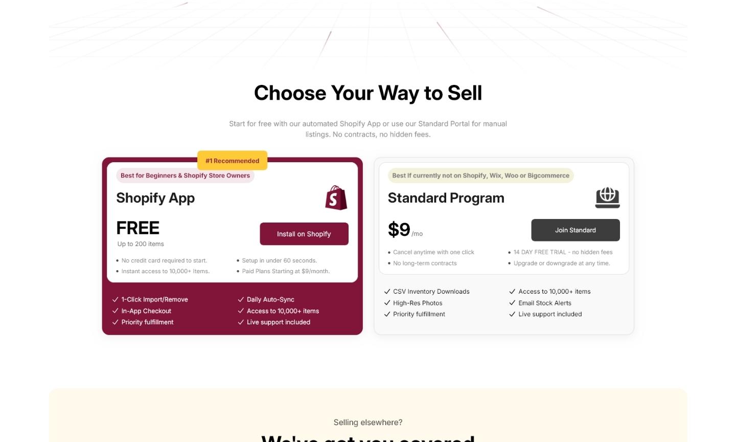
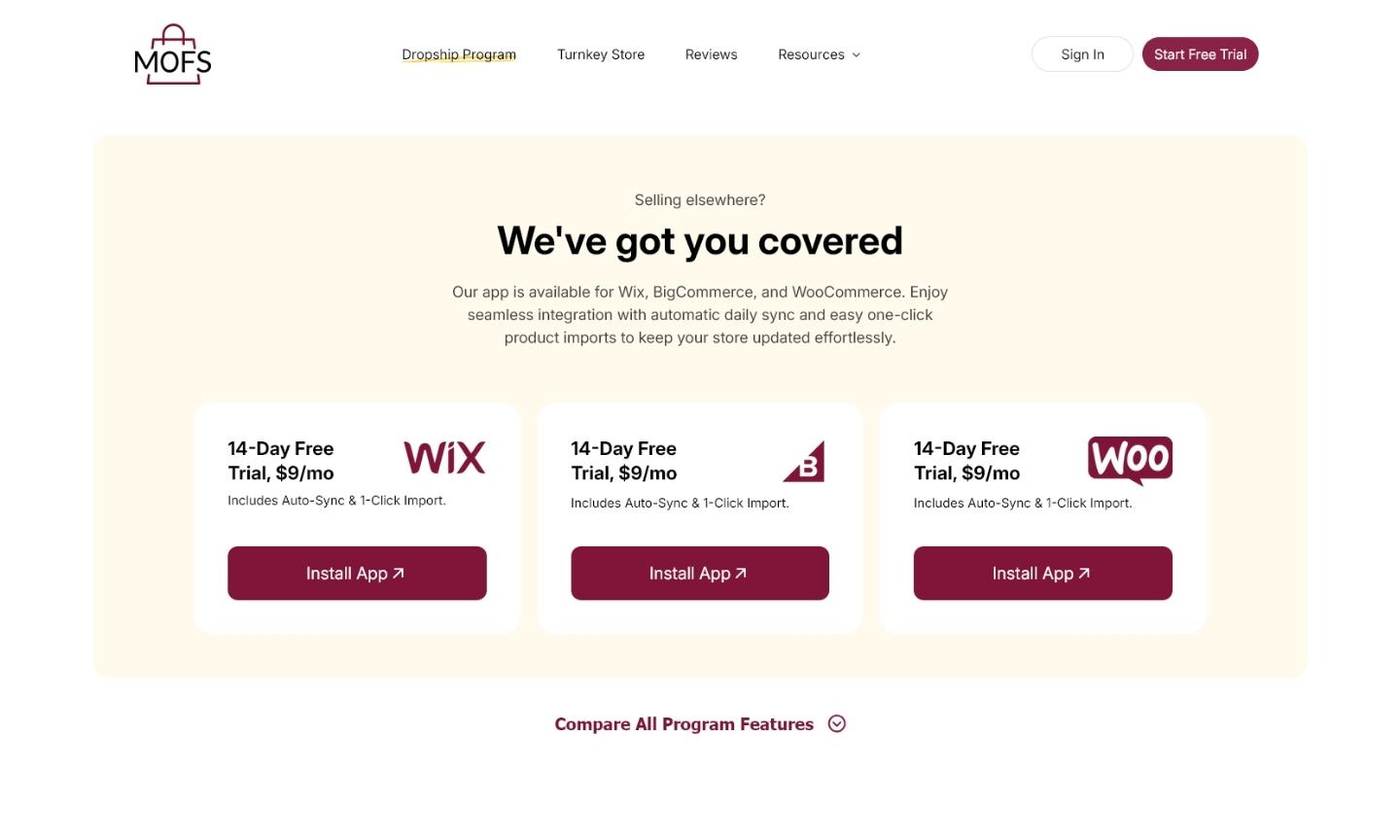
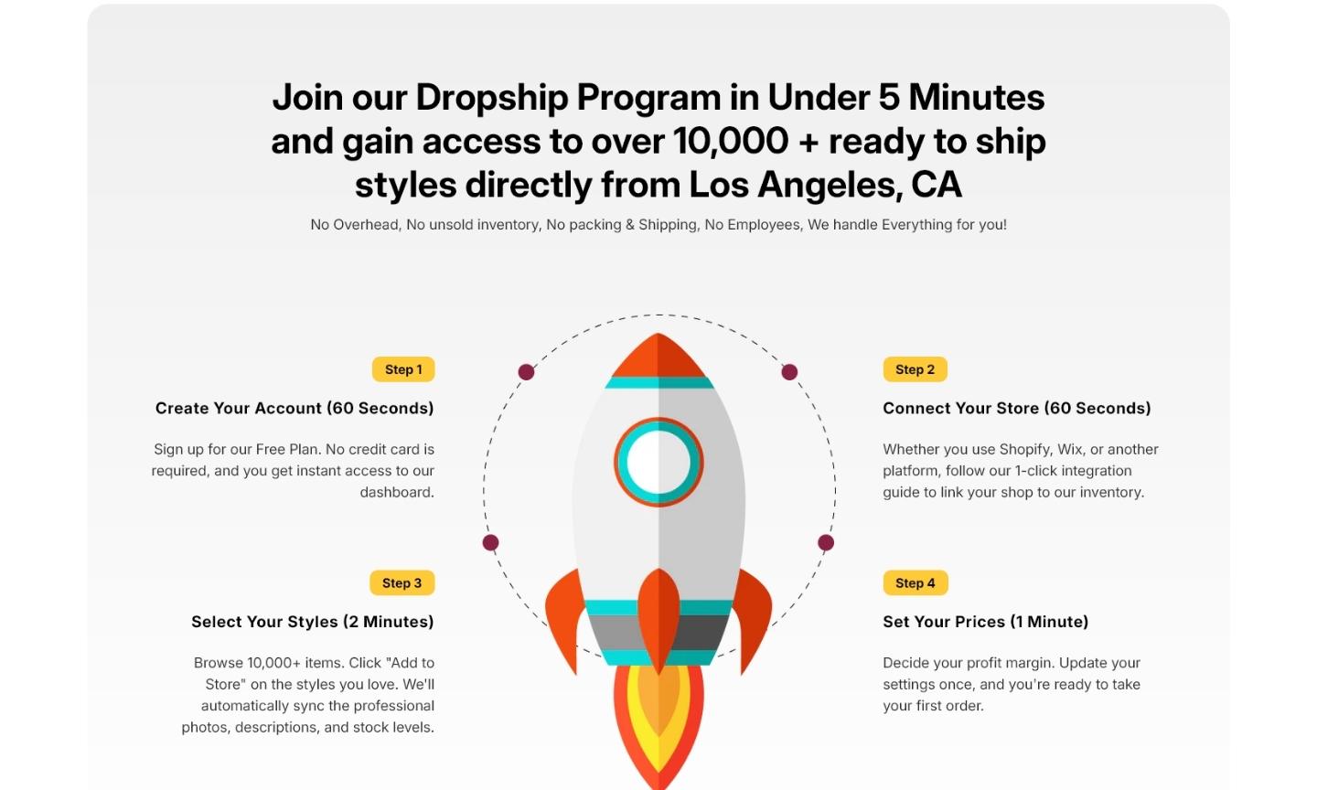
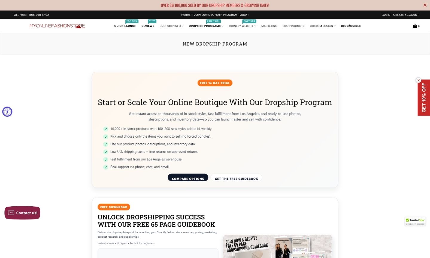
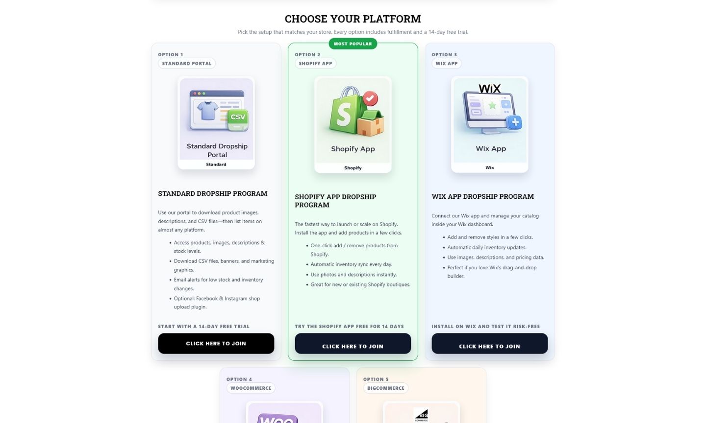
When communicating multiple pricing tiers, app integrations, and technical features, the biggest threat to conversion is cognitive friction. The original presentation of the dropship program overwhelmed prospective members with dense text blocks and convoluted onboarding steps. Users often struggled to quickly identify which integration plan (Standard, Shopify App, or Third-Party) was right for them. The challenge was to take this massive amount of critical data and restructure it so that it felt manageable, intuitive, and visually digestible, preventing potential drop-offs caused by “brain load.”
Solution
We executed a complete architectural overhaul of the page, prioritizing conversion rate optimization (CRO) and visual clarity. By implementing a clean, modular layout, we broke down the complex onboarding journey into a simple “3-Step Setup” visual narrative. We utilized strategic whitespace and highly readable comparison tables to differentiate the platform integrations, making the choice obvious for the user. Built cleanly within the native Shopify environment to ensure top-tier page speed, the new design uses “scrollytelling” to guide the user naturally from the initial value proposition down to the final call to action, dramatically streamlining the path to sign-up.
Results
View Some Screenshots from Old Design
The previous iteration of the Dropship Program page highlighted the classic struggle of B2B e-commerce: trying to say everything all at once. As seen in the legacy screenshots below, the original design relied on heavy paragraphs and a cluttered layout to explain its technical offerings. Comparing this to our new, streamlined architecture perfectly illustrates how removing visual noise and organizing data into clear, bite-sized sections drastically improves the user’s ability to understand the service and take action.
