MOFS Shopify App: UI/UX Redesign & Optimization
Overview
The MyOnlineFashionStore (MOFS) Shopify App is the operational heartbeat for thousands of dropshipping entrepreneurs. It serves as the primary gateway for merchants to browse over 10,000 fashion SKUs, sync inventory, and manage automated fulfillment directly from Los Angeles. For this project, we took on the challenge of completely overhauling the application’s user interface and experience. The objective was to transform a functional but visually dated backend system into a sleek, intuitive, and highly efficient workspace that empowers boutique owners to run their businesses seamlessly.


Challenge
Managing a massive wholesale catalog and navigating complex sync settings can quickly overwhelm users. The legacy MOFS application suffered from significant cognitive friction; it relied on dense data tables, an overloaded sidebar, and complex navigation pathways. When merchants log in to source products or check orders, they need speed and clarity, not a “wall of text.” The existing visual clutter was increasing the users’ brain load, making routine tasks like configuring product imports or filtering new arrivals feel tedious and time-consuming.
Solution
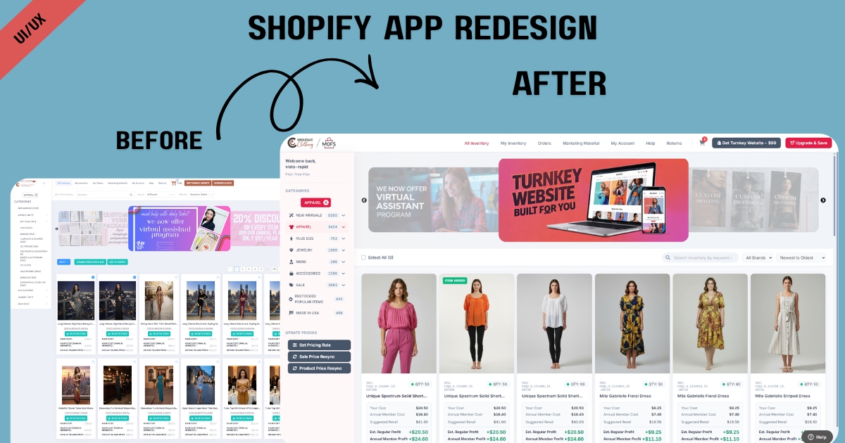
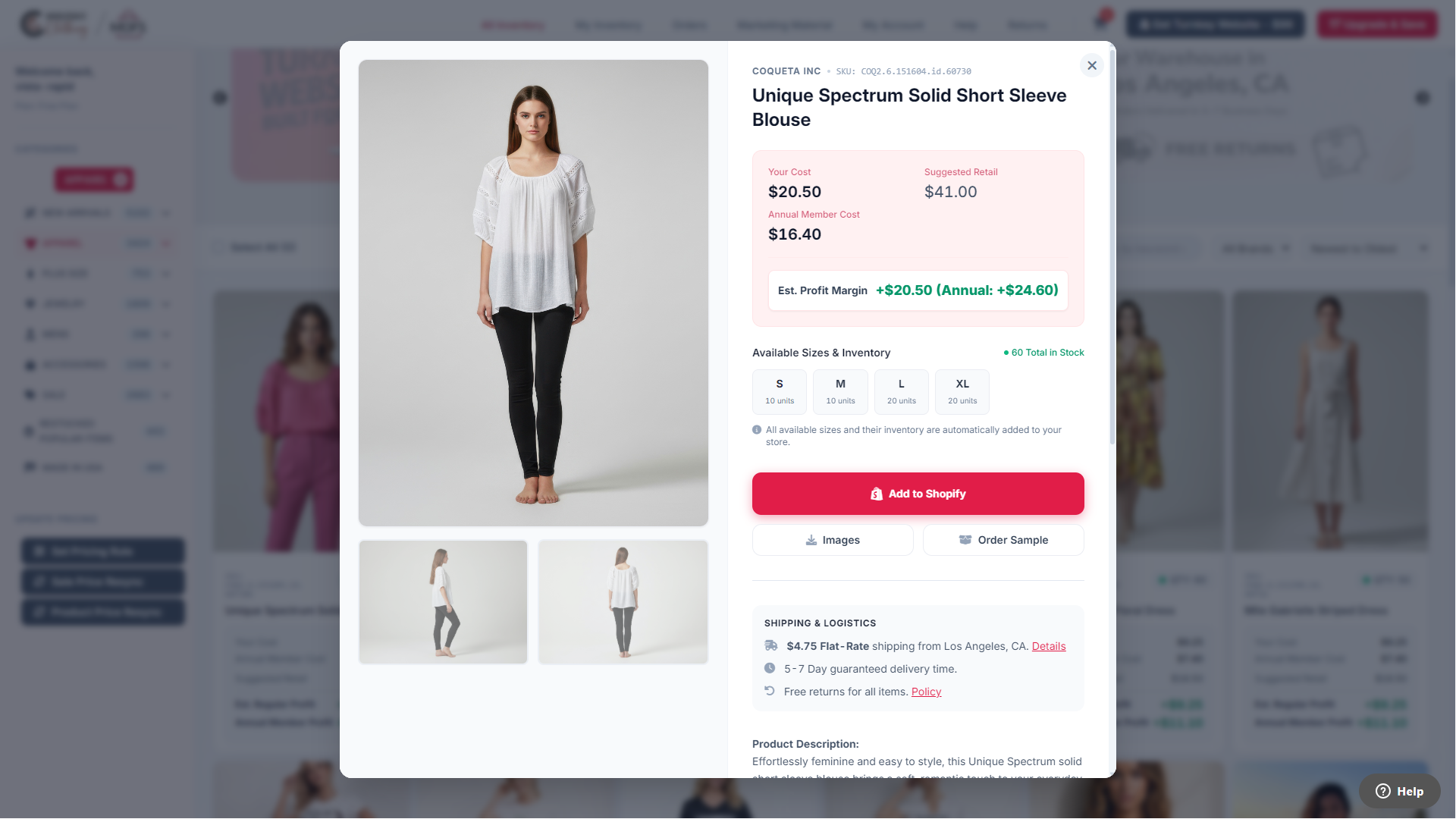
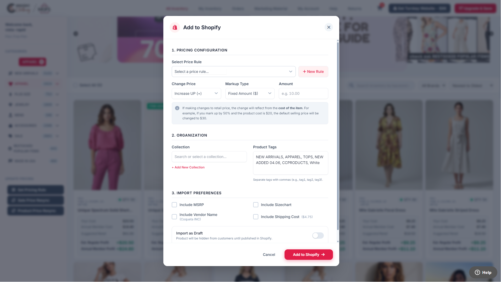
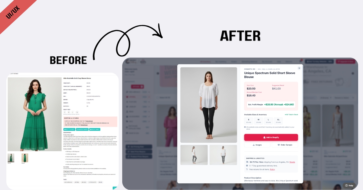
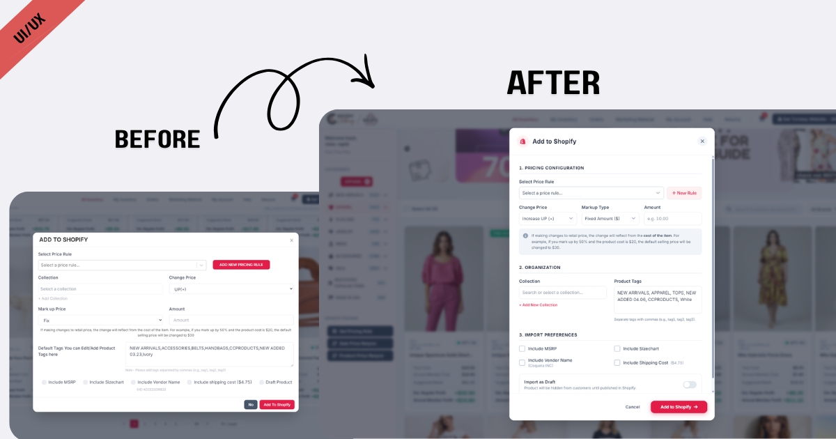
We executed a comprehensive UI/UX redesign rooted in modern application architecture and the systematic reduction of cognitive friction. By implementing clean, modular layouts and strategic whitespace, we broke down dense information into digestible, highly scannable sections. We completely redesigned the core “Add to Store” workflow, replacing heavy pop-ups with streamlined, intuitive configuration modals. The result is a fast, responsive, and visually balanced Shopify app that minimizes fatigue, allowing merchants to focus entirely on curating their stores and scaling their sales.
Results


View Some Screenshots from Old Design
To truly appreciate the efficiency of the new app, it helps to see where we started. The legacy application was built with a data-first approach that inadvertently sacrificed usability, resulting in a crowded and heavy interface. As you can see in the screenshots below, the original design required users to sift through significant visual noise. Comparing this to our redesign highlights the profound impact of stripping away clutter and establishing a clear, user-friendly visual hierarchy.


