Streamlining the MOFS “Done-For-You” Sales Funnel
Overview
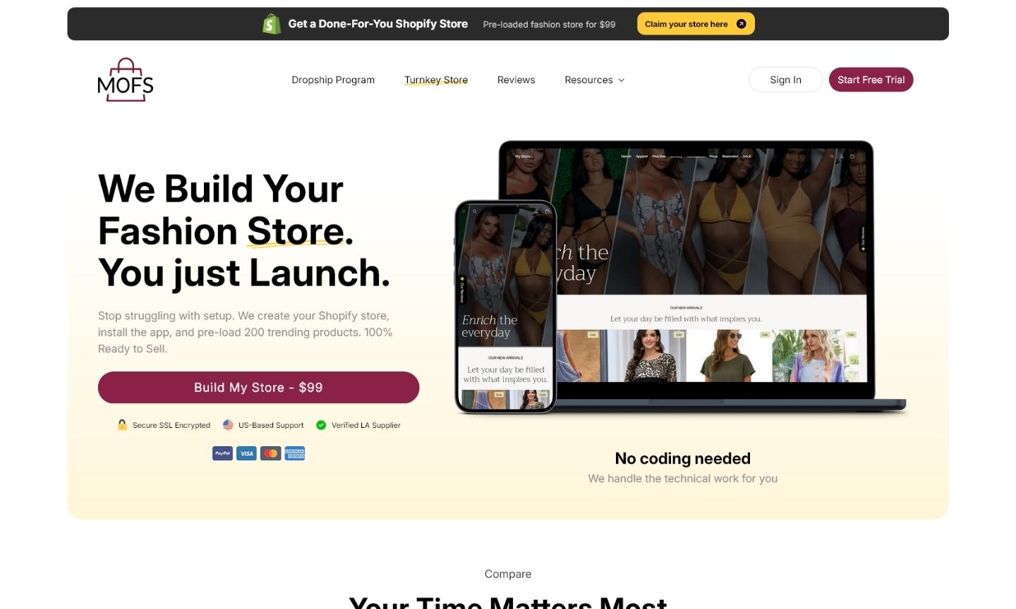
The MOFS Turnkey Website service is a high-value offering designed to eliminate the technical barriers of starting an online boutique. By providing a fully built, pre-loaded Shopify store for a single flat fee, the service targets entrepreneurs who want to skip the setup phase and go straight to selling. The goal of this redesign was to craft a landing page that perfectly communicated this “done-for-you” value proposition, inspiring immediate trust and guiding users seamlessly toward checkout.
Challenge
Selling a complete business setup in a single package requires overcoming natural buyer hesitation. The previous iteration of the page suffered from cognitive friction; visitors were forced to digest a heavy mix of technical features, onboarding steps, and app inclusions all at once. When potential buyers are overwhelmed by the how, they often lose sight of the why. We needed to simplify the messaging, clearly contrasting the “hard way” of a DIY setup with the “easy way” of the MOFS Turnkey solution, without burying critical details in walls of text.
Solution
We rebuilt the page from the ground up using native Shopify architecture and Custom Liquid, ensuring lightning-fast load speeds across desktop and mobile devices. By applying rigorous Conversion Rate Optimization (CRO) strategies, we structured the content into highly digestible visual blocks—such as the “Three Simple Steps” workflow and a direct comparison chart. This strategic “scrollytelling” approach drastically reduced brain load, creating a frictionless funnel that naturally leads the user right to the purchase button while maintaining peak website performance.
Results
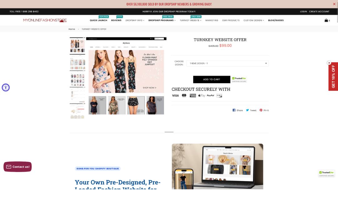
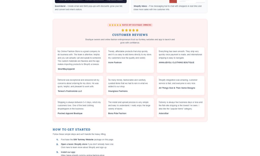
View Some Screenshots from Old Design
Before our intervention, explaining the comprehensive nature of the Turnkey service often resulted in a visually crowded layout. As shown in the legacy screenshots below, earlier versions relied heavily on dense text to explain the setup process and app inclusions, inadvertently increasing the user’s brain load. Seeing this older design highlights the dramatic impact of our UX overhaul—demonstrating how strategic whitespace, modern UI, and clear visual hierarchies can transform a complicated pitch into an effortless conversion.